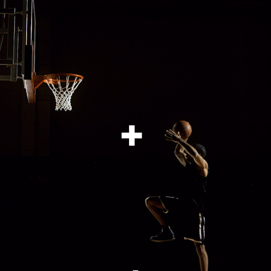


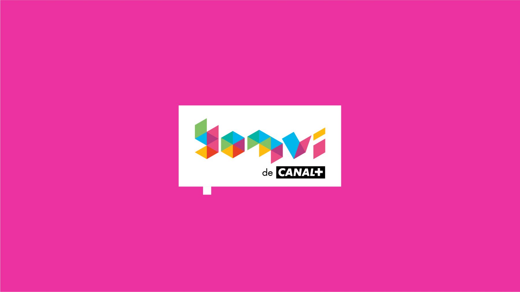
01.
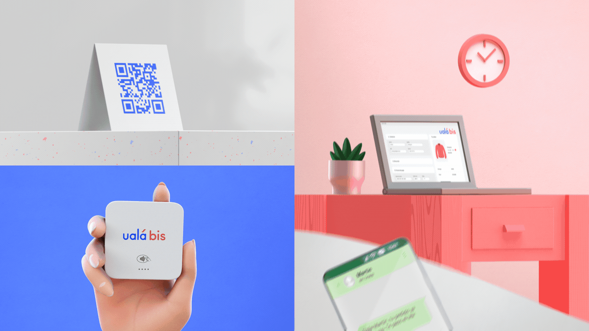
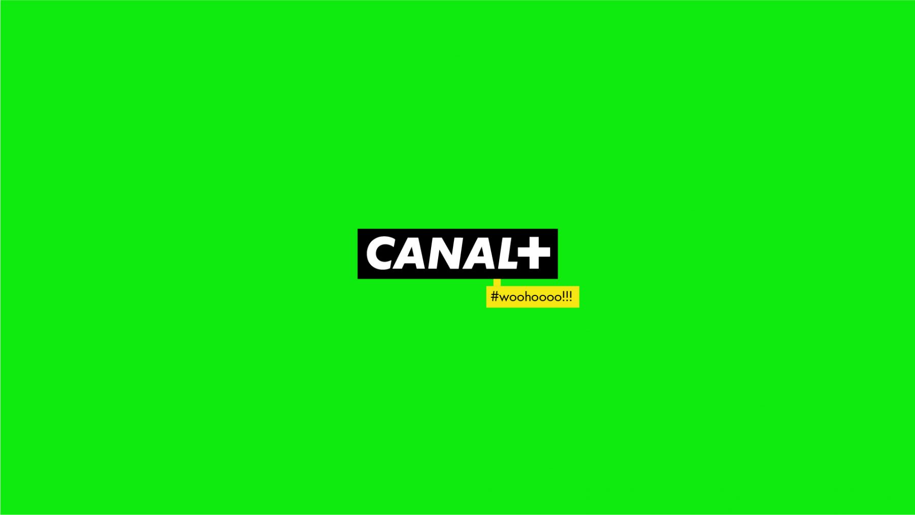
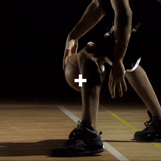
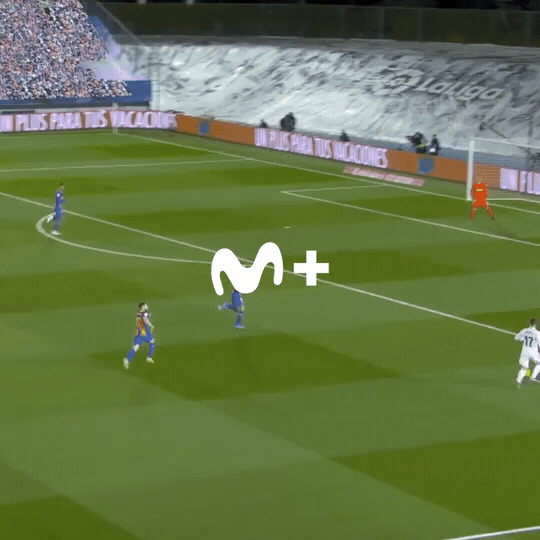
Using the logo as the main axis of the entrance and exit of the pieces, we kept the symbol as a cursor (+).
This was used as a general guide for paths and movements, and to conceptually promote the fact that the brand has more to offer every time you log in.
In some cases the + behaves as a video reproduction "slider", moving forward or backward in time; in others, it works directing and guiding to the different transitions of the pieces.
The result is a subtle, simple and modern package, giving the necessary space for the brand to function as a frame for the content that approaches to its users.


01.
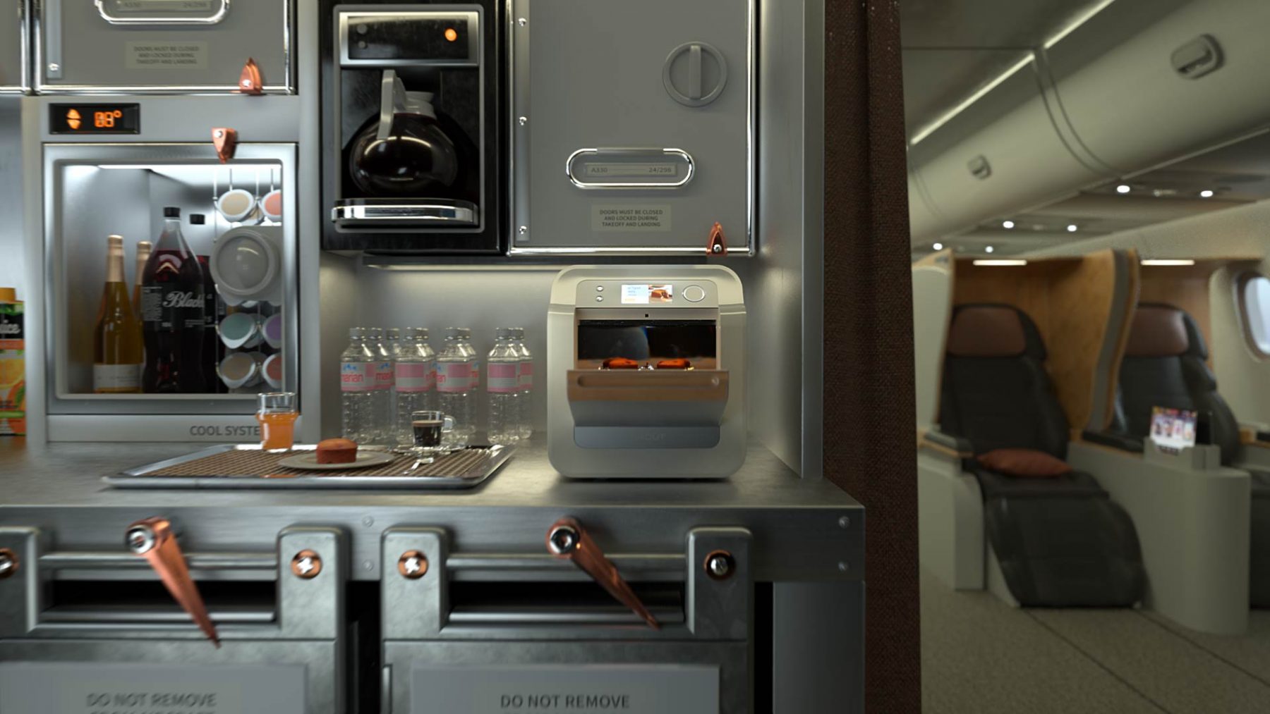
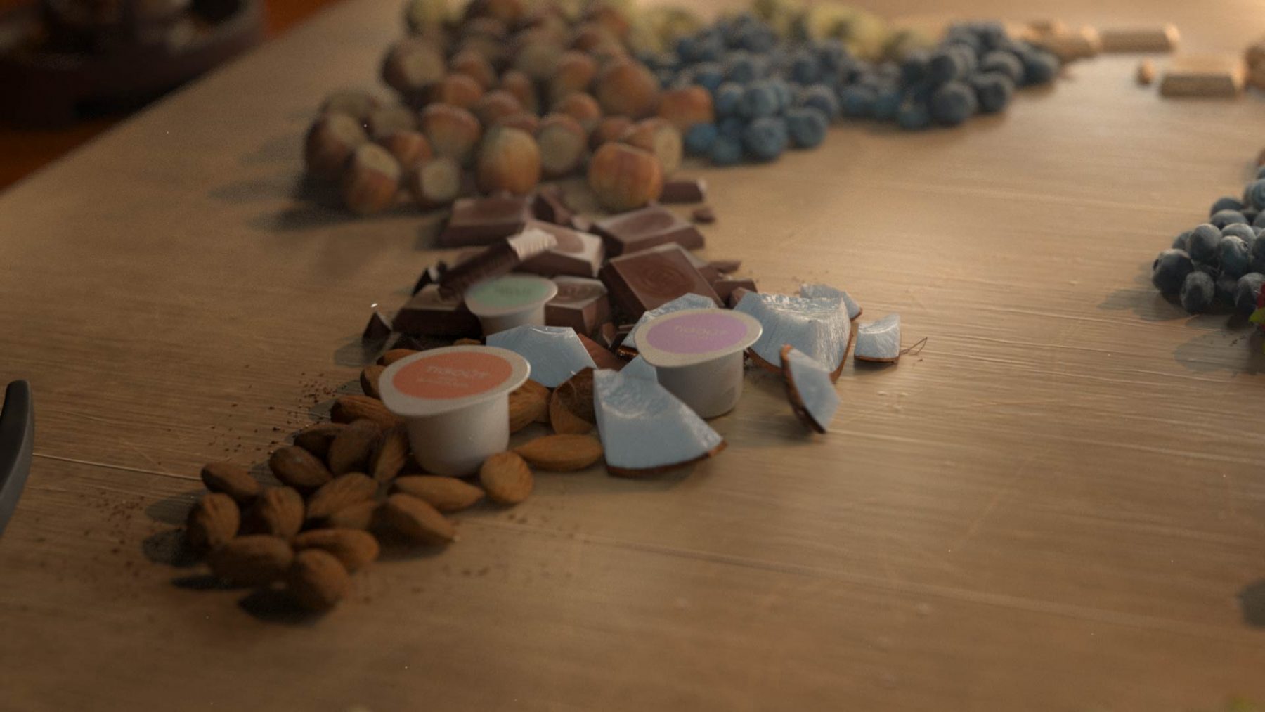
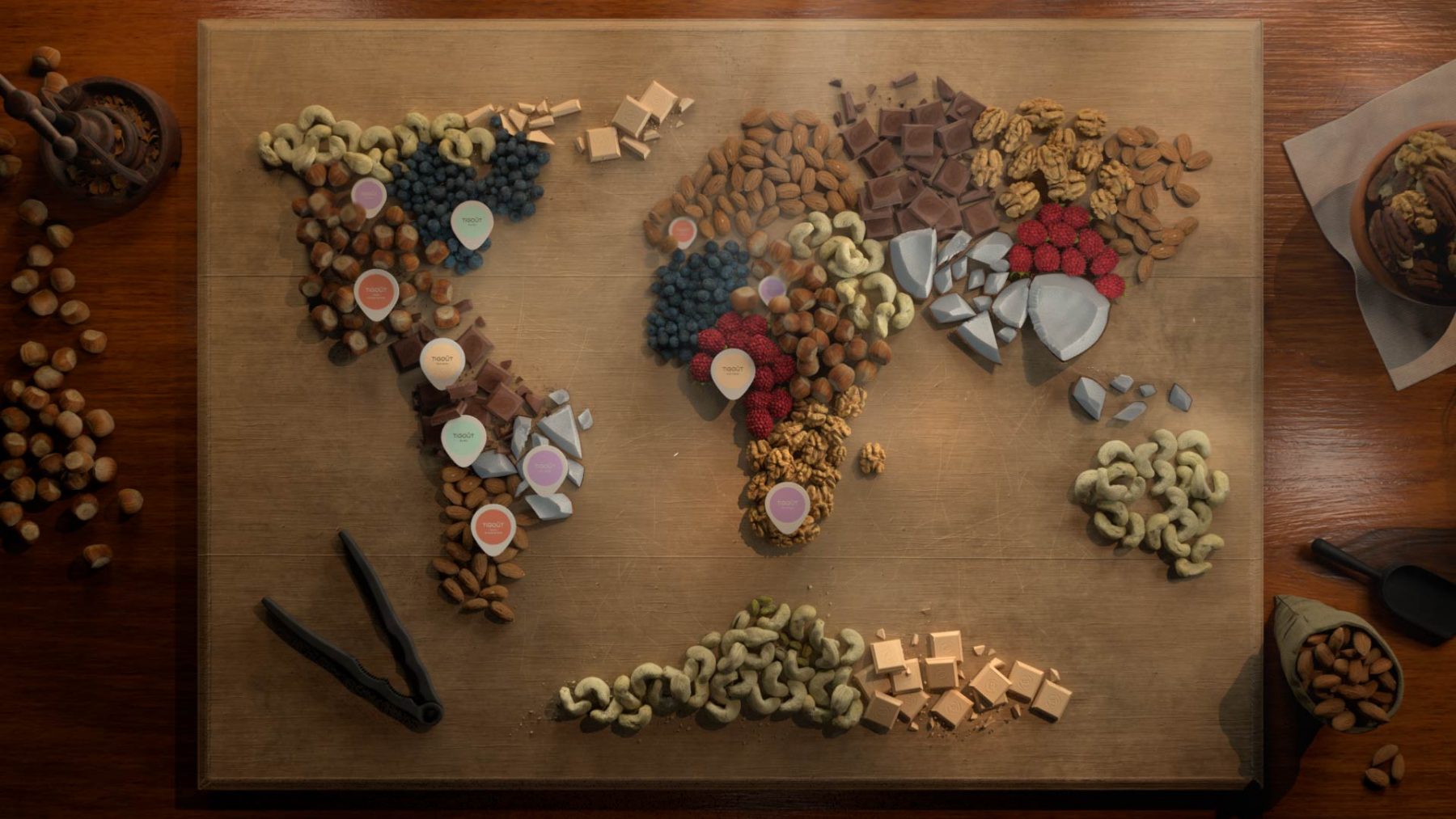
Process