02.

Selected Projects

Universal – Rebrand

Movistar Plus+

Uala

IOSI

CN – Wake Up

HBO

Tigout

Nat Geo Kids

Canal+

Expansive waves, lights and movement, these are the assets that we generated to bring a clear relationship between Universal and the new channels.

  • Brand Identity
  • Creative Thinking
  • Visual Identity

M+ wanted to give life to their brand in a strong and stylish way, we joined forces with Plenty to create the animation of their branding and make the content the main feature on the Spanish leading platform.

  • Animation
  • Brand Identity
  • Design

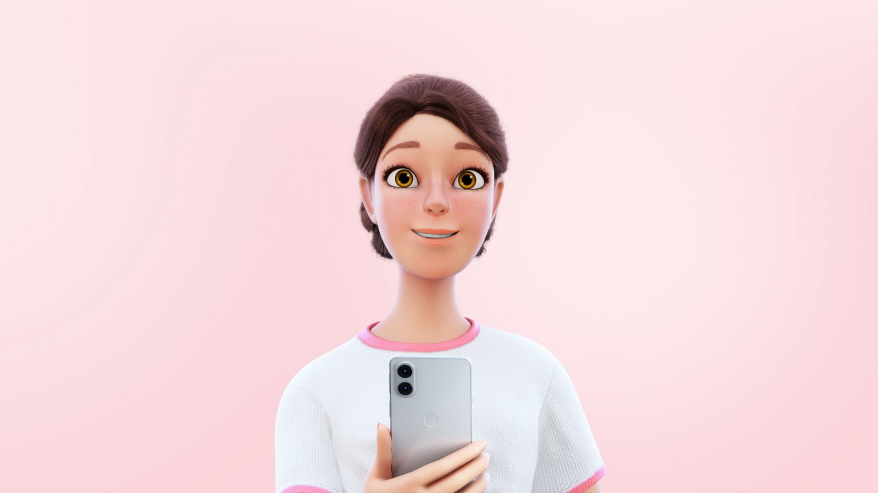
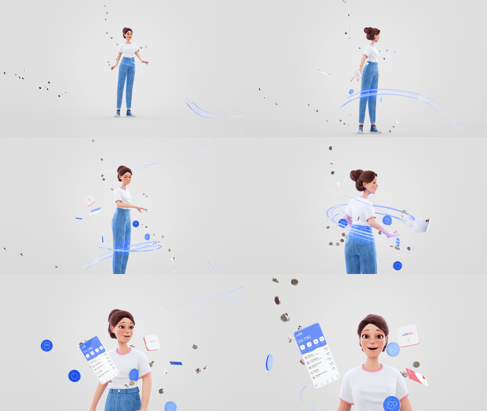
Ualá approached us with an important request: they needed a spot to explain how to use the app and all the advantages the brand have to offer. With all the possibilities of Ualá in mind, we development a creative strategy that allowed us to represent how the brand could make people´s daily lives easier. This led us to create a script that smoothly integrated the apps´s interface with the users´daily lives.

  • Creative Thinking
  • Motion
  • Strategy

Secrets and lies that intertwine an entire country. For fans of crime and espionage, this series has what it takes. We created with Amazon the Key Art for ''Iosi, el espía arrepentido''. It was important to show the complexity of the main character and the dynamics generated with the rest of the protagonists. Looks that point to different horizons, explosions and a cold treatment of the image impose mystery and put the viewer in the mood of the plot.

  • Design
  • Visual Identity

We all want to start our day in a good mood, that's why we worked with Cartoon Network on a graphic package that will fill the morning of the little ones with energy.

  • Creative Thinking
  • Design
  • Motion
  • Visual Identity

We worked together with HBO to create a look that is both On-Air and Online, so that when we are On-Air, we have the illusion of controlling the platform in the same way it works Online.

  • Brand Identity
  • Visual Identity

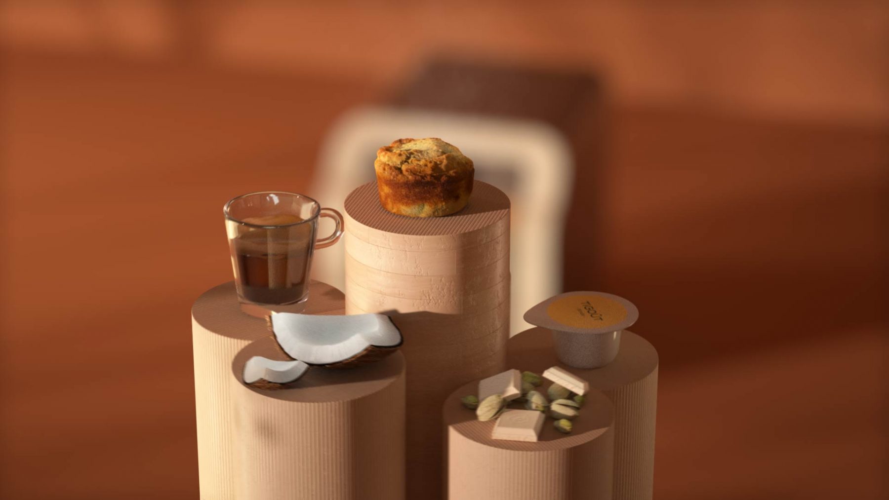
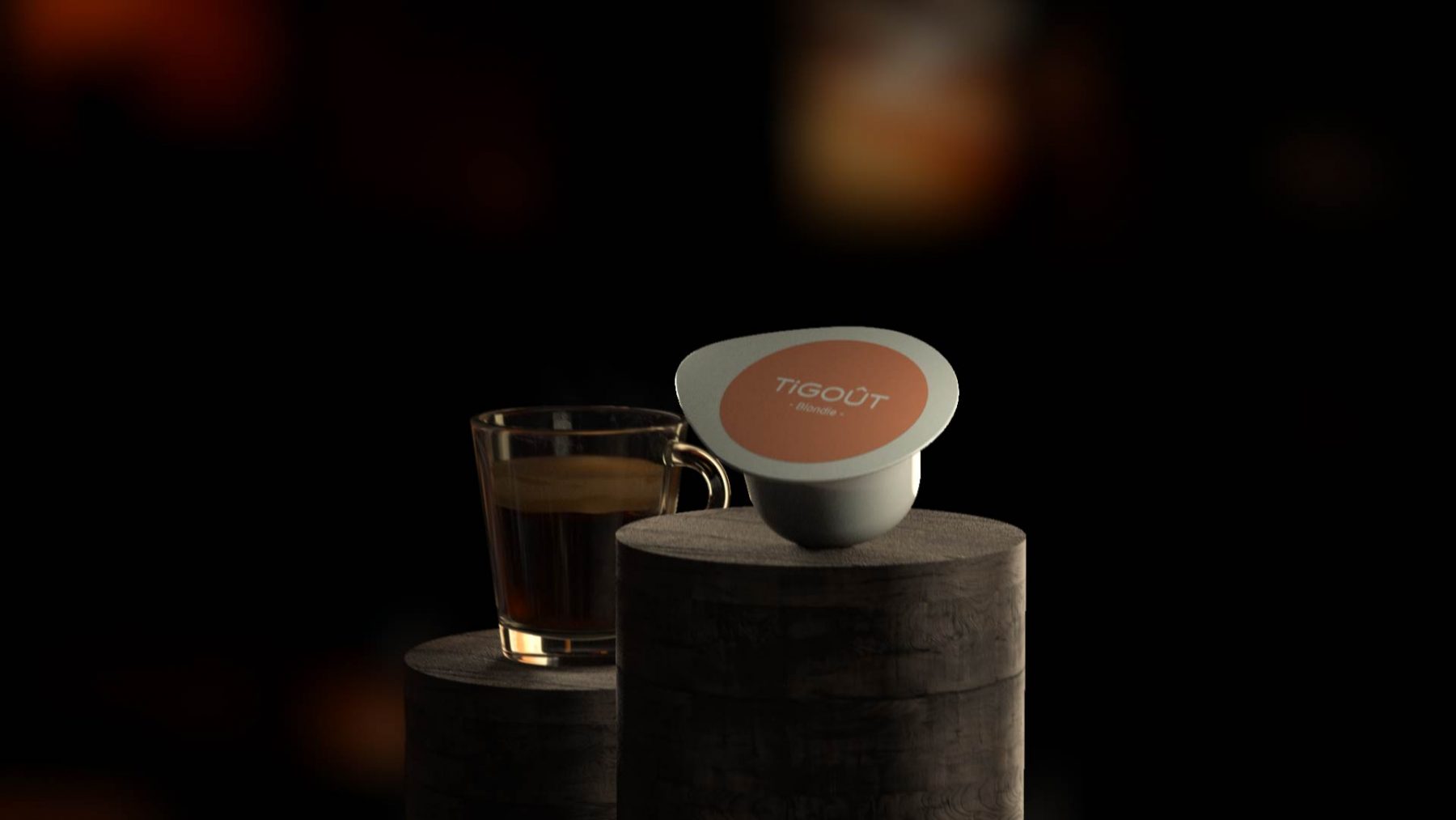
Tigout was a project where we wanted to show what happens when you mix a quality product with technology. The result was the same combination brought to the design and animation, where we could explore new techniques such as photogrammetry, to scan different desserts and speed up the realization process, with a realistic finish.

  • Brand Identity
  • Creative Thinking
  • Design

The project concept for this Rebrands was based on how to convert the Nat Geo logo, the world-famous Yellow Frame into a playful scenario taking the premise: "Because we know you are curious" as our starting point.

  • Brand Identity
  • Design
  • Strategy

The TV Branding was based on very simple graphics resources such as speech bubbles for the audience to express themselves, emotipluses covering the entire screen so the channel and the audience can have their own code and the wide color palette that differentiates the 14 channels and enriches the network as a whole. The animation code is very close to the digital platform. Everything moves to the rhythm of the "+" , the Channel icon, that sets the pacing, guides us through the navigation pieces and discover the extensive Canal + grid.

  • Brand Identity
  • Creative Thinking
  • Design

Universal – Rebrand

  • Brand Identity
  • Creative Thinking
  • Design

Movistar Plus+

  • Brand Identity
  • Creative Thinking
  • Design

Uala

  • Brand Identity
  • Creative Thinking
  • Design

IOSI

  • Brand Identity
  • Creative Thinking
  • Design

CN – Wake Up

  • Brand Identity
  • Creative Thinking
  • Design

HBO

  • Brand Identity
  • Creative Thinking
  • Design

Tigout

  • Brand Identity
  • Creative Thinking
  • Design

Nat Geo Kids

  • Brand Identity
  • Creative Thinking
  • Design

Canal+

  • Brand Identity
  • Creative Thinking
  • Design

Movistar Plus+

M+ wanted to give life to their brand in a strong and stylish way, we joined forces with Plenty to create the animation of their branding and make the content the main feature on the Spanish leading platform.

Year

2021

Industry

Tv Branding

Services

Animation

Brand Identity

Design

01.

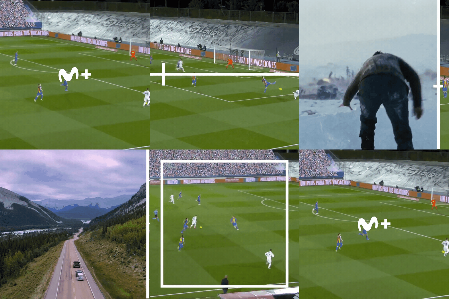
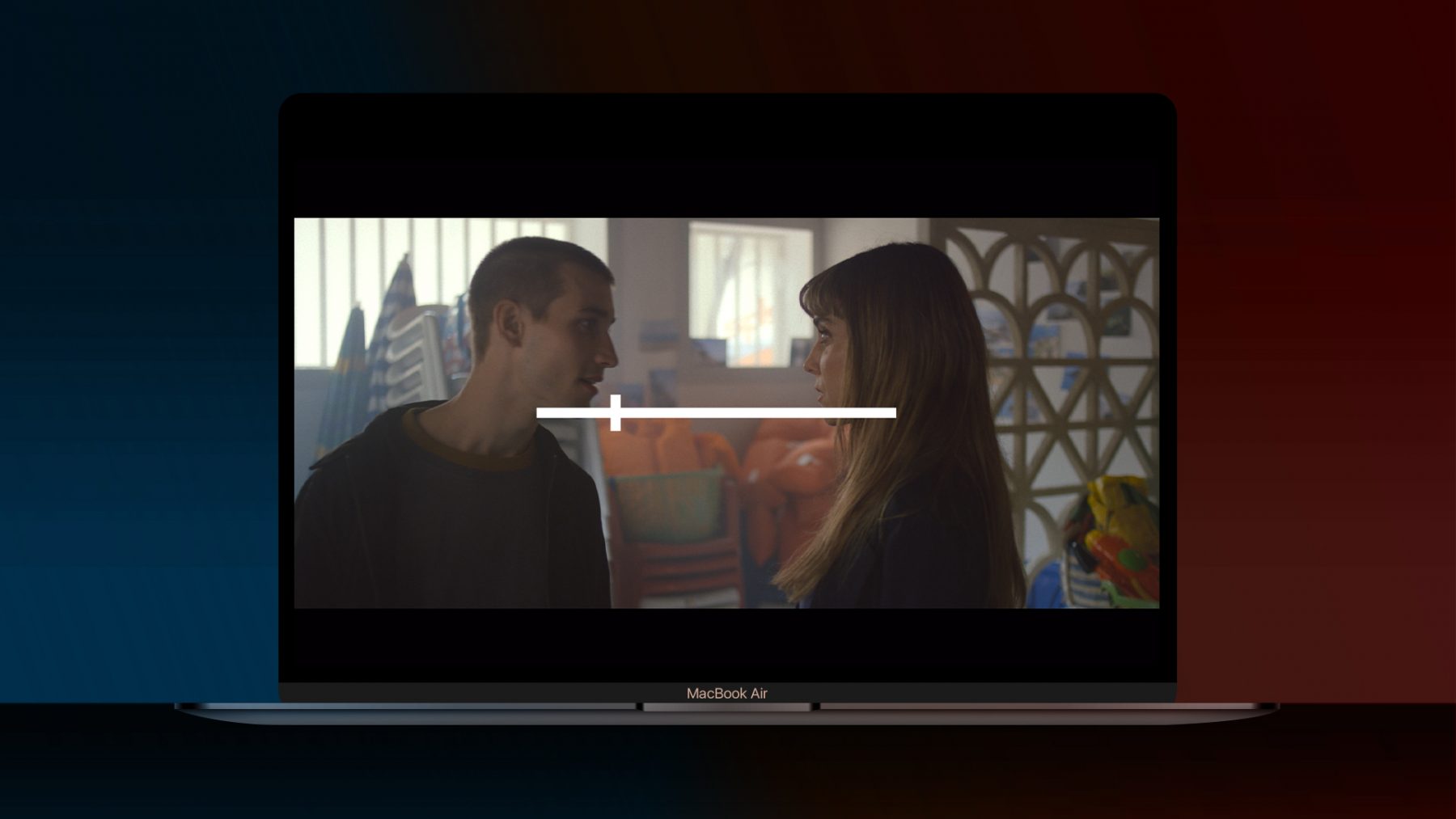
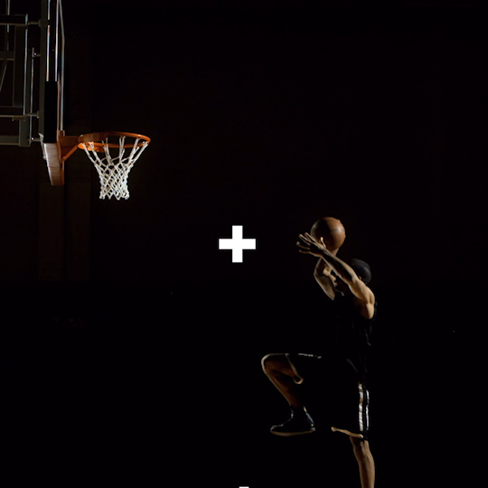
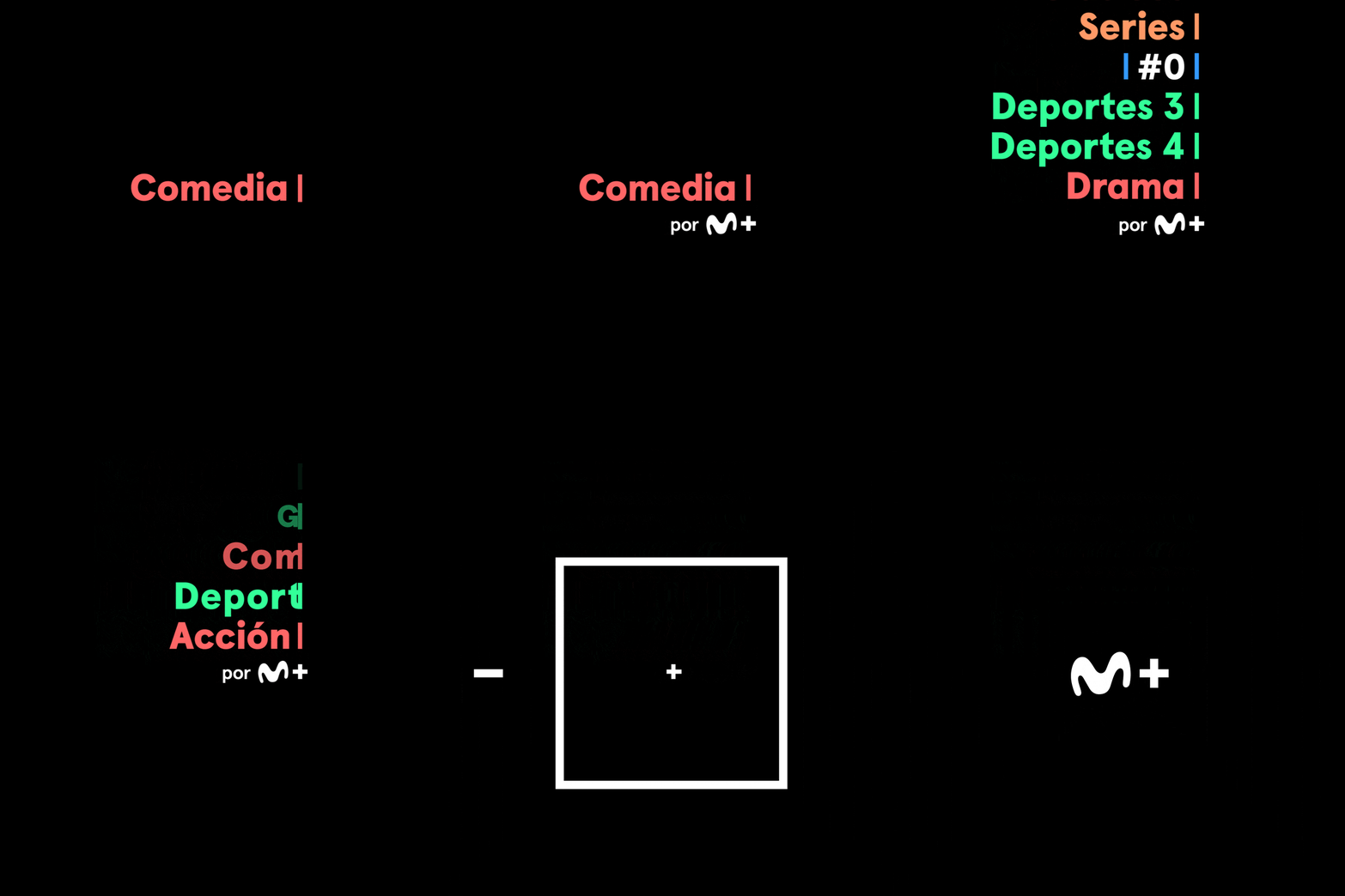
Using the logo as the main axis of the entrance and exit of the pieces, we kept the symbol as a cursor (+).
This was used as a general guide for paths and movements, and to conceptually promote the fact that the brand has more to offer every time you log in.

In some cases the + behaves as a video reproduction "slider", moving forward or backward in time; in others, it works directing and guiding to the different transitions of the pieces.

The result is a subtle, simple and modern package, giving the necessary space for the brand to function as a frame for the content that approaches to its users.

01.

Process

Credits

  • Conceptual & Creative Development: Sopa
  • Graphic Design Director: Erretres
  • Plenty More & Plenty:
  • Creative Director: Victoria Sanchez
  • Motion Director: Hernan Estevez
  • Executive Producer: Valeria Gigli
  • Design & Art: Lucía Izco
  • Animation: Martin Muerza, Pablo Ferreiro & Juan Di Carlo
  • Music: Lolo Micucci
  • Sound Technician: Javier Zubizarreta
Back to top

Manifesto

Services

Brand Strategy

Our creativity is fueled by our strategic mentality, with the ability to resolve any challenge that may pop up, from briefs to final product.
We think and develop branding and communication strategies to achieve the objectives set in each phase of the project.

Visual Identity

We have an extensive network of collaborators who stand out in their areas where our clients belong.
We work with the selected team to create visual identities that stand out in the market and represent the personality of our clients.

Adversiting

We specialize in storytelling, with great resources at our disposal we can develop high impact communication campaigns having Plenty's team close to carry out the productions.

Experiences

Understanding that not all clients need the same thing is key, that's why we create innovative experiences, to help them reach new markets outside the traditional channels.

Featured Clients

Movistar Plus+

M+ wanted to give life to their brand in a strong and stylish way, we joined forces with Plenty to create the animation of their branding and make the content the main feature on the Spanish leading platform.

Year

2021

Industry

Tv Branding

Services

Animation

Brand Identity

Design

01.

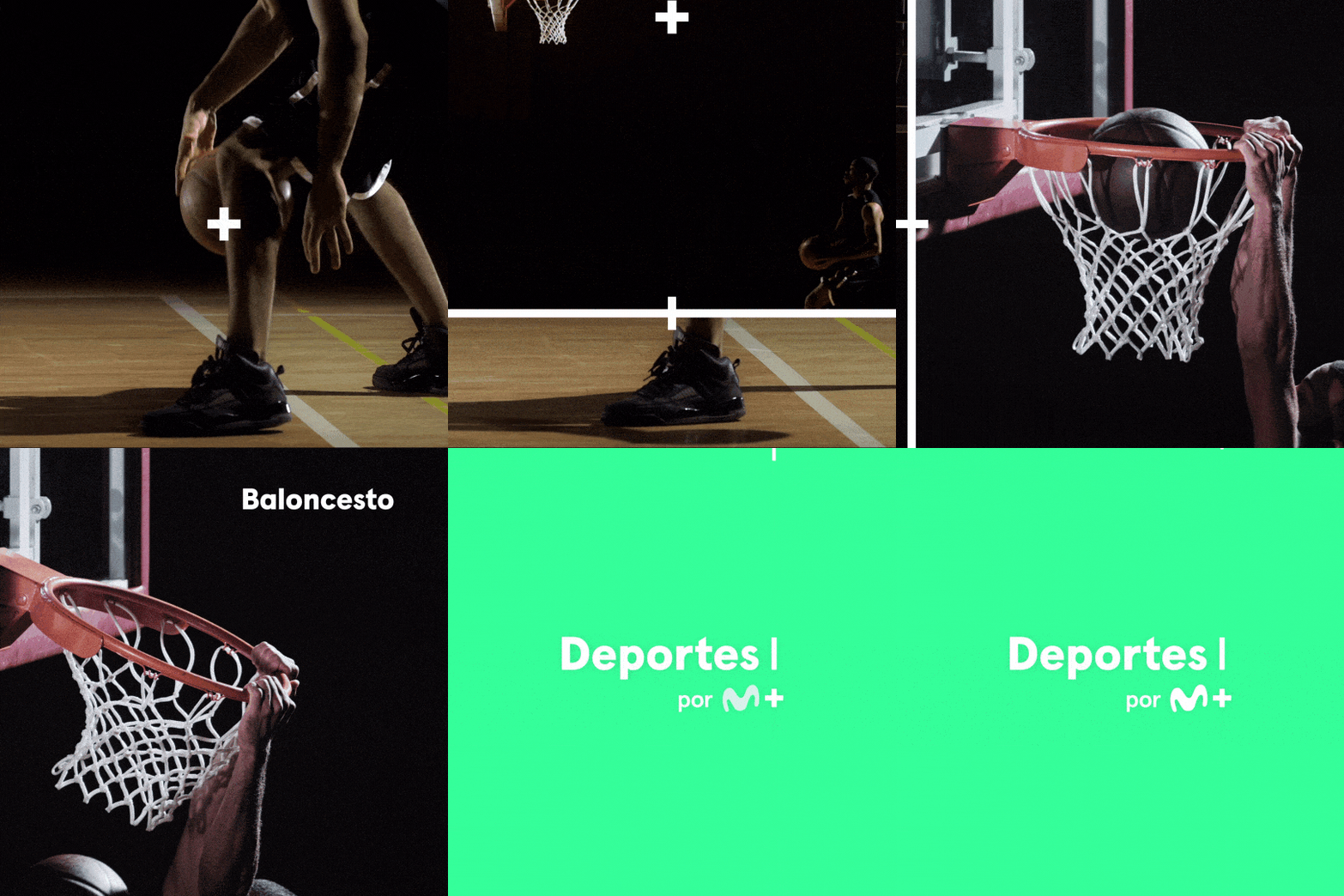
Using the logo as the main axis of the entrance and exit of the pieces, we kept the symbol as a cursor (+).
This was used as a general guide for paths and movements, and to conceptually promote the fact that the brand has more to offer every time you log in.

In some cases the + behaves as a video reproduction "slider", moving forward or backward in time; in others, it works directing and guiding to the different transitions of the pieces.

The result is a subtle, simple and modern package, giving the necessary space for the brand to function as a frame for the content that approaches to its users.
01.

Process

Credits

  • Conceptual & Creative Development: Sopa
  • Graphic Design Director: Erretres
  • Plenty More & Plenty:
  • Creative Director: Victoria Sanchez
  • Motion Director: Hernan Estevez
  • Executive Producer: Valeria Gigli
  • Design & Art: Lucía Izco
  • Animation: Martin Muerza, Pablo Ferreiro & Juan Di Carlo
  • Music: Lolo Micucci
  • Sound Technician: Javier Zubizarreta
Back to top