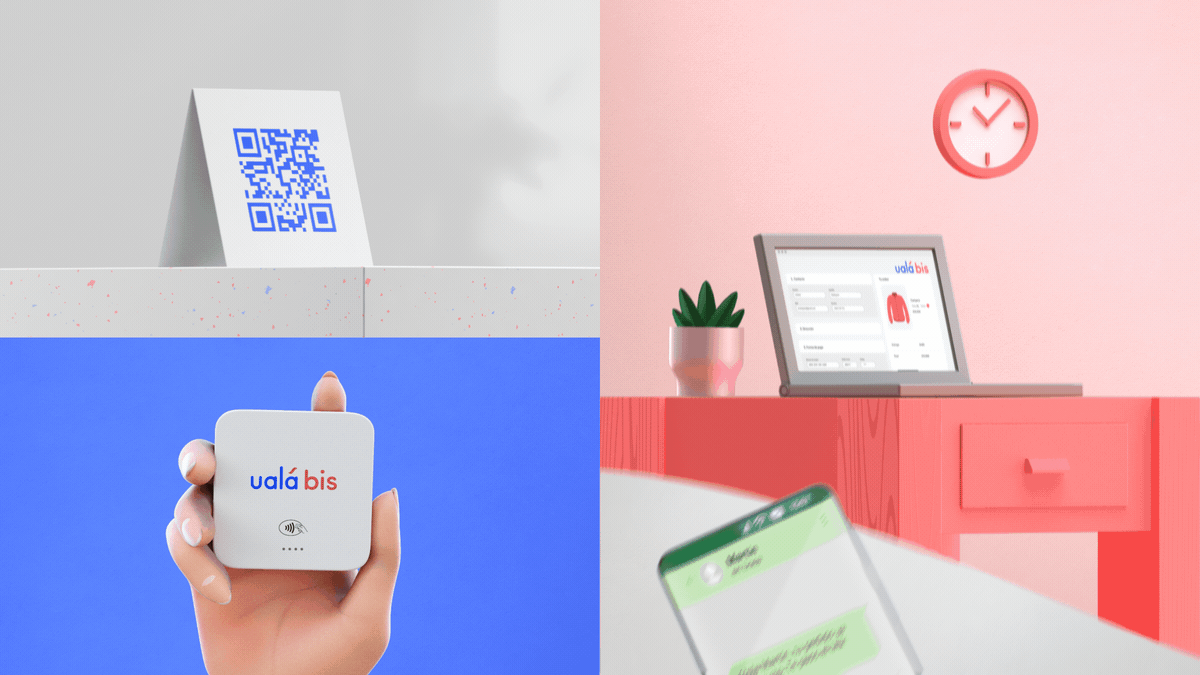


01.
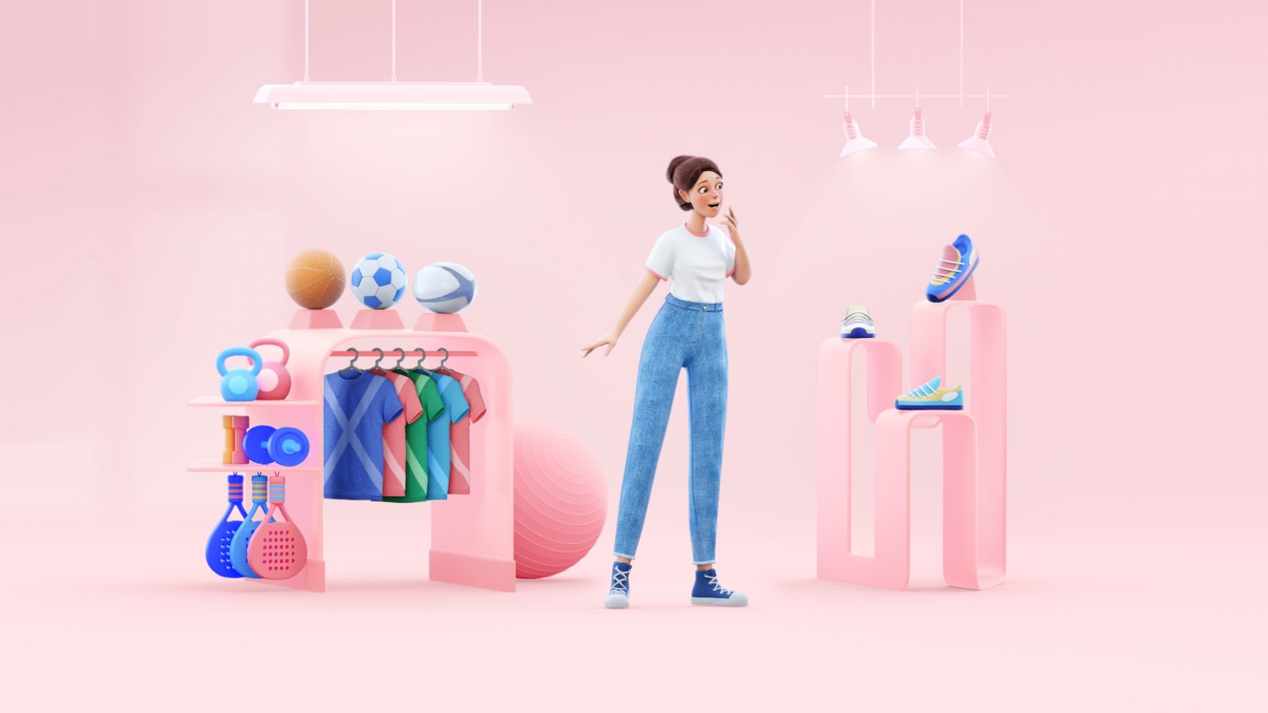
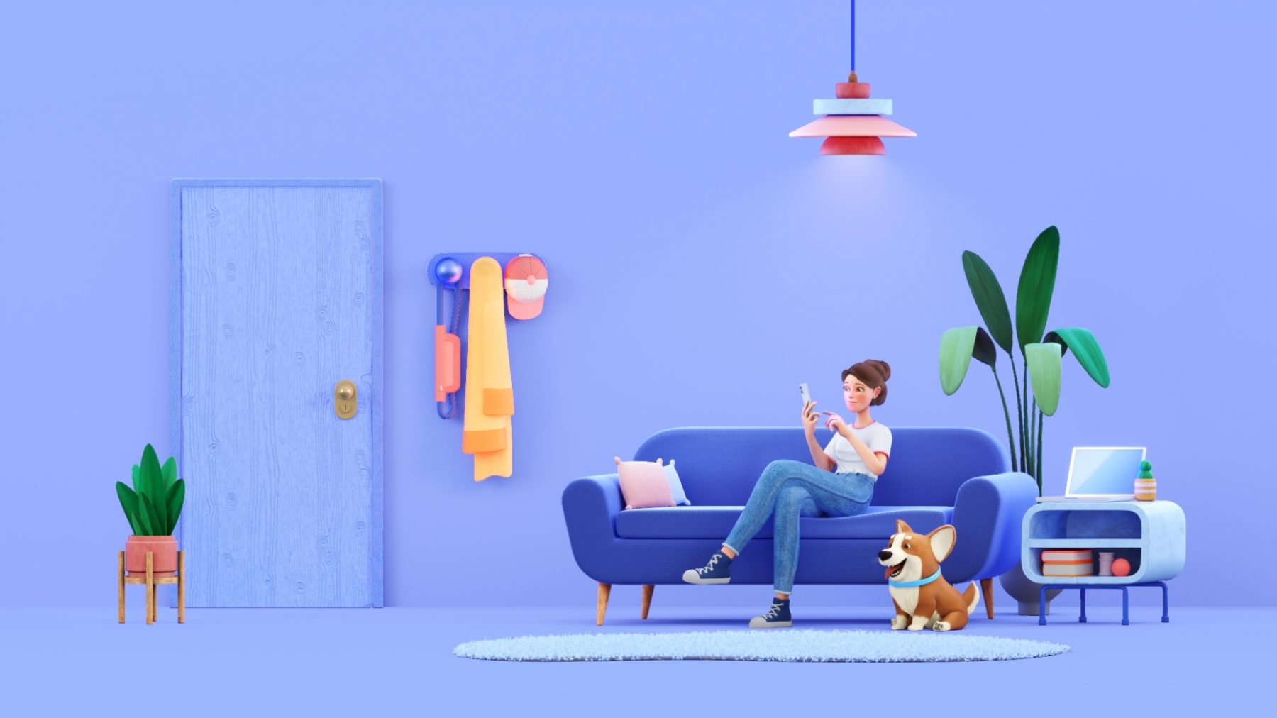
We used a color palette that initially came from the brand itself, and added some tones that conveyed warmth and simplicity. Then we designed the different scenarios where users could use the app, showing how the simplicity of Ualá allowed them to get in touch with personal finances from anywhere.
The final result is this piece that simplifies the way to see Ualá and provides clarity when it comes to understanding its uses and possibilities, helping the brand to approach new users in a friendly and direct way.